Saturday, 31 January 2015
Friday, 30 January 2015
Thursday, 29 January 2015
William Dalebout
William Dalebout is a illustrator who works almost exclusively with vector graphics. He has worked with large companies such as Coca Cola and Disney but also has completed work for smaller companies in his local area. His experiences have influenced his work from him learning Mandarin he has realised that "Every element has to be beautiful in its own right" developing his unique style.
Wednesday, 28 January 2015
Copy
From William Dalebout collections, I decided to copy this piece of work.
I first created a pallet of colours from pulling out colours from the original image.
I then started vectoring the key elements, in Illustrator, of the portrait ensuring they were the correct shape.
I struggled created the iris due the range of detail needed and the variety of colour. I had to use a radial gradient and vectors to create the lines. After this I had to create a clipping mask.
I then used another clipping mask to keep the iris in the eye and added shading.
Tuesday, 27 January 2015
Drafts
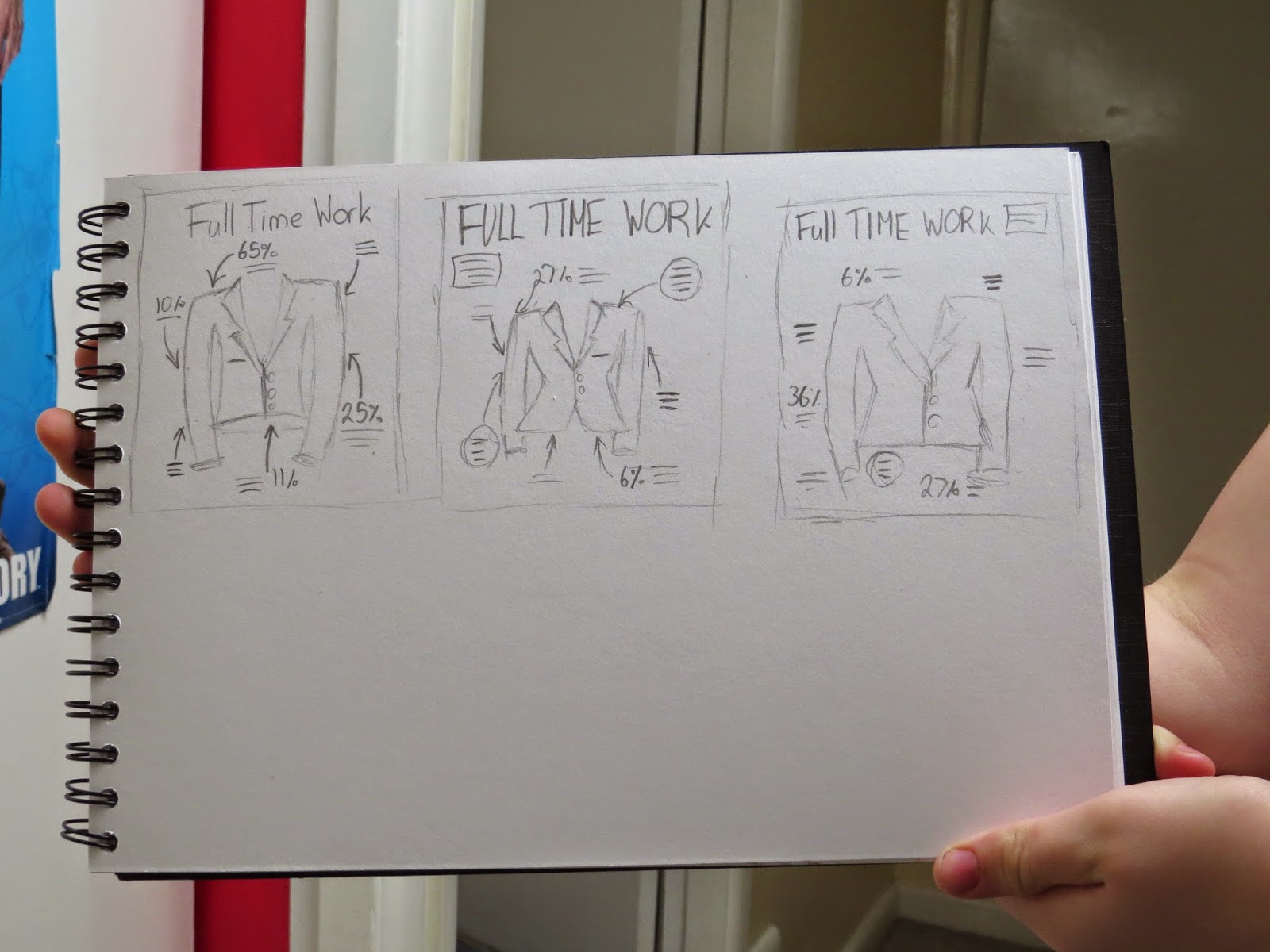
From my previous scamps I decided on 3 I liked the most. I then tried developing them further through layout and illustrations.
Experimenting with subject matter drawings
First I created a set of brushes in photoshop and adjusted the width and hue.
Similar to a paper, I did a rough sketch to understand proportions of the body as well as the shape. I did this all on one layer so all the elements could be adjusted.
On another layer, I worked on the actual body using the lines to help me develop the image.
Sometimes I did not stick to the initial sketch as it did not work.
For some areas I used the reflect tool to copy a stroke and add symmetry to the image.
Some elements I drew separately and then placed into the image later which was very helpful.
Small elements in the image seemed to make it look better and more realistic.
Monday, 26 January 2015
Emulations
From my copy of William Dalebout I decide to emulate that this into my timeline infographics.
ADD PICTURES OF PENCILS
I first used the eyes looking at the greens and purples in a radial gradient. I then created a clipping mask, to create the lines.
I then worked on the lips. Although, I drew out curvy lips with light and dark areas I felt that a u shaped bottom was more appealing and looked better.
I then looked at light and dark areas of the face. I added blusher through a Gaussian Blur for the cheeks and lowered the Opacity. I also added two layers to define specific areas.
When I was happy with the face, I then looked at the hair. I decided I wanted it more symmetrical so I reflected the piece on the left hand side. I also added hair strands.
I then added strands within the hair, I did this using vectors and applying gradients which I then edited angle and size.
Sunday, 25 January 2015
Further Research
I decided to develop the history of the perfect body further and found some very interesting videos and information. I then summarised these into dates.
Saturday, 24 January 2015
Digital Type choices
I printed of different digital type some for display type and other from text. I then evaluated them so that I could decide what to do in my final piece.
Subscribe to:
Comments (Atom)


